Beige interiors are undeniably popular. Yet tackling one can feel like a thankless and difficult task — it seems far easier to paint a wall a bold colour and bring in some on-trend furniture. Building a genuinely interesting interior in shades of beige is a real challenge, and only a handful of designers are up to it. For those willing to take the risk, we spoke with Ivan Mirolubov, art director of the studio "Tochka Dizayna" to find out how to work with beige.

Who is this colour for?
Why do people love beige interiors so much? The answer is simple: this kind of design relies on familiar, legible means of expression. The colour palette is free of complex combinations, and the furniture forms are straightforward and easy to read at a glance. For the very same reason, interiors in this colour so often end up feeling dull.
Beige is a steady, dependable shade. It avoids sharp edges and provokes no strong reactions, unlike many other colours. Those who choose it tend to be fairly conservative. A beige interior should never shock — it must remain "even". The colour can also be read as elegant, and is often called the second black or white.
The challenge
Every interior works as a combination of three elements: colour, material and form. Beige is neutral — which means everything else must follow the same logic. Introduce overly complex forms and the sense of airiness and elegance will tip into ornate excess. Balance is essential. If you are drawn to decorative mouldings or elaborate light fittings, exercise restraint. Use a striking chandelier to single out the dining area rather than scattering such accents throughout.

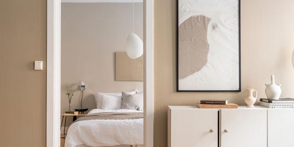
Beige can also be introduced into an interior as a delicate ornamental pattern that reads as a single colour field from a distance, adding textural variety to the space. Such an interior rewards close attention: it shifts and transforms depending on the angle from which you observe it.
Stylistic preferences
Every style has its own preferred means of expression and its own visual language. Loft, for instance, shuns colour, compensating for its absence with an abundance of textures — brick, concrete, exposed wiring, wood, metal. Beige appears most often in two stylistic directions: in something close to classical and in a contemporary idiom. Within the classical interpretation, beige turns up in several guises.

One example is carved decorative elements — mouldings, ceiling roses or elaborate cornices. The cardinal rule is not to overdo it. Push too far and you end up with the vulgar interiors of the late 1990s. Furniture with intricate carved detailing should likewise be used sparingly, so as not to burden the space with unnecessary detail. Patina is best avoided altogether: let beige take centre stage.
In general, a contemporary beige interior dispenses with carved elements, which can sometimes make it look like minimalism. In our studio we jokingly call this style "beigeimalism". Unlike its source, however, it can accommodate elements that serve no functional purpose — a cascade of pendant lights, for instance, hung more for their visual appeal than to illuminate the space. In minimalism it is the other way around: concealed lighting exists solely to fulfil its function.
Light
A beige interior thrives on light, so one approach is to introduce materials that reflect it. To avoid an overly bright result, opt for natural polished stone, chrome or brass accents. These should be used sparingly. The natural patterning of stone is ideal for reinforcing the idea of an interior built on half-tones, and it brings textures to the space that reward a closer look.
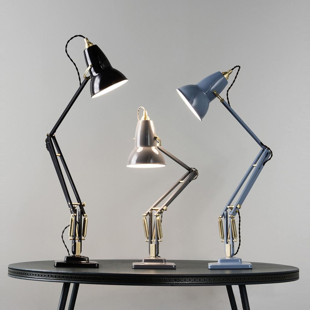
Lighting that zones the space is also a common feature of such interiors. Pendant lights or lamps might be used, for example, to define a dining area or a seating group. Fixtures are kept to simple geometric forms so that no particular motif is legible in them. Botanical, animalistic or other decorative themes would undermine the logic of the interior.
Coherence
Coherence is an essential quality of a beige interior. This means choosing a single flooring material for the floor and a single colour for the walls. That said, accents need not be abandoned entirely — the key is to ensure they do not fragment the space into small, competing parts.

For this reason, it is better to avoid pure, open colours. A beige interior looks elegant precisely because of its muted palette. It takes considerable experience to avoid pushing the saturation too far and arriving at something vulgar. Accents are best introduced through half-tones — complex cool greys, mauves or olives, for instance.
A poorly chosen pattern can equally undermine the sense of lightness in an interior. In such cases, abstract motifs with no figurative image work best — geometric patterns are the ideal choice.
Not blending into the walls
Beige interiors carry two risks: too few accents, or too many. Finding the right balance in the use of expressive elements is essential. What should you pay attention to? First, choose objects with interesting forms — they stand out naturally against beige walls and prevent the space from dissolving into an undifferentiated whole.
Bear in mind the 60/30/10 rule as well. All expressive elements should be divided into proportional parts. For example, 60% given over to beige tones, 30% to interesting upholstery on the sofas, and 10% to gold or chrome details. This is an important principle for striking the right balance and creating a memorable interior that never dissolves into one undifferentiated beige mass.
If you enjoyed this article, we recommend reading about a apartment whose interior is designed in a monochromatic palette, or about the Swedish hotel Ett Hem — a quintessence of Scandinavian aesthetics.
Follow us on social media so you never miss new content: VKontakte, Telegram — @loskomagazine.