Quality bottle design from the world's best design studios
Every day we see hundreds of examples of packaging on the shelves of supermarkets and shops. Some are appealing enough to make us reach for a product; others simply put us off.
The Losko magazine editorial team has brought together nine remarkable designer bottles created by graphic design studios from around the world.
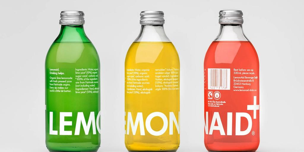
1. Lemonaid drink
Strong sales in chain supermarkets are impossible without striking packaging. That is whyThe Studiodeveloped a clear, accessible design for the German charitable organisation«Lemonaid», which produces the drink of the same name.
They proposed using a glass bottle with an aluminium cap — a choice that sets the drink apart from the mass of anonymous, plastic-packaged alternatives. The selected bottle shape also looks attractive and sits comfortably in the hand.
The logo and all other information are printed directly onto the glass — no films, no labels. The designers enlarged the Lemonaid name so that it wraps all the way around the bottle, ensuring the brand is visible no matter how the bottle is placed on a shelf.
The international symbol of aid and support — the cross — also makes an appearance, though the designers chose not to render it in red, which would have undermined the bottle's design concept.
2. Tangent GC cosmetic bottles
The studioEssen Internationaldeveloped a unique packaging design for the Swedish brandTangent Garment Care, and it is remarkably simple: a light background, black type. That is all. True white minimalism.
What makes this packaging stand out, however, is its considered typography. A monospaced typeface keeps even the smallest text legible and easy to read — something that matters enormously on a cosmetic bottle.
The minimalist approach is more than fitting here. The dominance of white reinforces the purity of the garment care formulas, free from synthetic and other harmful additives.
3. Bottle branding for the MØS Gastronomic Smart & Casual restaurant
Scandinavian motifs formed the basis of the visual identity for the Moscow restaurant MØS Gastronomic Smart & Casual. This influence is felt not only in the identity itself but in the overall atmosphere of the establishment. A warm, light-filled interior, natural materials and wholesome food draw visitors into the enigmatic world of Scandinavia.
The studio Backbone Branding also turned to the natural environment, stylising elements from nature. The result was four primary compositional forms: a band, a free arrangement, a pattern and a single large simplified element.
Every element of the identity is pared back to its essentials and rendered exclusively in black and white, allowing it to be applied in any context without compromising the coherence of the concept.
4. SOTO SAKE spirit
In the world of alcoholic beverages, the appearance of a bottle matters no less than the quality of its contents. It was for this reason that the producer of the original Japanese sake SOTO turned to professional designer Joe Doucet for help in finding a compelling concept. The cornerstone of the solution was clarity in design.
The colour palette consists of three colours: black, white and light grey. The typography is as simple as it is considered. The result is a bottle that looks effortlessly stylish and is destined to stand out on retail shelves.
But the real interest lies in the details. Three elements of the label simultaneously signal the drink's Japanese origin: the inscription Imported from Japan, Japanese characters and a transparent circle. When the bottle is placed against a red background, it takes on the appearance of the flag of its country of origin. The circle also allows the clarity of the liquid inside to be assessed.
5. The snow-white bottles of Rice Wine
«Rice Creative created the Rice Wine bottles themselves as a gift for their clients at Tết, the Lunar New Year. The glass conceals a rare, handcrafted wine made by Vietnamese farmers from a small village, whose recipe was kept secret within a single family for 200 years.
Despite this heritage, the designers chose to create a contemporary, minimalist package — and their decision to go with a functional design proved to be exactly right.
Every detail here serves a specific purpose. Take the numbers 30, 40 and 50: they clearly indicate the alcohol content. But notice how the weight of the typeface increases with the alcohol level — and how the numerals are die-cut into the label. This is no accident: the transparent contents of the bottle are visible through them.
6. Leeds Juicery packaging
Leeds Juicery is a small natural juice producer based in Yorkshire, United Kingdom.Abbas Mushtaq (Abbas Mushtaq) from Leeds took on the creation of the company's visual identity and brand development.
The design centres on purity, mindfulness and wellbeing — the very values promoted by the ancient Indian science of Ayurveda, which also inspired the logo. Three circles represent the Ayurvedic elements of vital energy — balanced and in harmony.
All imagery, print and promotional materials are applied to recycled paper. Each piece of packaging is hand-signed, reinforcing the image of a small local producer making a natural product.
7. Sandows London cold coffee drink
Sandows London is a cold coffee drink producer. To secure shelf space in major retailers, the brand needed distinctive packaging. British design studioStudio Thomas rose to the challenge.
The idea came from an adjacent product category. Studio Thomas took as their starting point a bottle reminiscent of those used for spirits. The colour of the drink reinforces this association, while the cap label calls to mind an excise stamp.
The result is striking: Sandows' product is guaranteed to stand out on supermarket shelves.
8. A gift chocolate cream liqueur from the Believe in studio
Christmas is a time to enjoy beautiful things with the people we love. That is why theBelieve in studio created this elegant gift.
OAC (Only At Christmas) is a wonderful way to festively thank clients, friends and, of course, family. The studio team selected a locally produced orange and chocolate cream liqueur with its distinctive Christmas aroma, devised a new name for the product and created special seasonal packaging. The luxurious labels incorporate a Christmas gift tag where personal festive greetings can be written.
The labels were first developed digitally, then printed and finished by hand in the studio. Each limited-edition bottle is individually numbered on gold paper kindly supplied by GF Smith.
9. JC dark lager beer packaging
SPI Group is a well-known drinks company. For one of its corporate events, the company invited renowned winemaker Jean Claude, an avid yachtsman and passionate beer lover.
A limited batch was brewed especially for the guest and named JC in his honour, requiring the creation of a logo and packaging. Jean Claude's passion for yachting served as the central theme for the design.
«Tomatdesign» is ranked among Russia's best creative agencies by the AKAR rating.