The Norwegian krone has undergone a significant visual transformation. In late May 2017, the Central Bank of Norway put new banknotes into circulation. This time, the bank chose to move away from traditional portraits in favour of a more contemporary design that captures the spirit of the country.
In this article you will learn what makes the new banknotes unique, why the design was developed by two separate studios, and what brief the Central Bank set for the competition.

To create the new design, the Central Bank of Norway launched a competition in spring 2014, attracting around 70 studios and designers. For each denomination, the bank specified a particular theme connected to the sea. In the end, two projects emerged as joint winners — by studios The Metric System and Snøhetta Design — and their ideas were combined in the final result. For now, only the 50- and 200-krone notes have been issued; the remaining denominations are planned for later release, with the highest, the 1,000-krone note, scheduled for 2019.
A country's banknotes are often the first point of contact a visitor has with a place. The impression they make can set the tone for everything that follows in a person's relationship with that country. In other words, money is a calling card — one that can reveal a great deal about a nation.
Norway's new banknotes fulfil that role admirably. Below, we first look at the competition entries from the two winning studios, and then at the result of their subsequent collaboration with the central bank.
The Metric System's project
The Metric System is a graphic design studio based in Oslo. They worked alongside Norwegian illustrator Terje Tønnessen, who created the imagery for the notes. Each banknote in the studio's treatment tells its own story about the Norwegian way of life — its distinctive character, cultural heritage and society. Their concept was designed to inspire Norwegians and evoke positive feelings and vivid memories associated with the coastline.
The reverses of the notes depicted different stretches of coastline, representing the country as a whole across the series of illustrations. Ultimately, however, these designs were not carried through to the final version.
Snøhetta Design's project
For the obverse of the notes, architecture and design studio Snøhetta offered a series of black-and-white photographs depicting various manifestations of the country's coastline.
For the reverse side, the designers proposed cubic patterns arranged to form an ornament. The design is partly based on the ideas and work of German physicist Peter Richter. In particular, it bears a resemblance to the book The Beauty of Fractals, which presents complex mathematical computer imagery. But this is not simply an abstract blur — it is a representation of the Beaufort scale, a system that allows one to estimate wind speed approximately by its effect on objects such as dust and tree branches, or on waves in the open sea. The longer the lines in the patterns, the stronger the wind they symbolise.
The final result
Following the competition, the jury decided to combine both concepts: the front side would use illustrations by The Metric System, while the reverse would feature the avant-garde pixelated imagery developed by Snøhetta Design.
As no images of the finished banknotes are freely available, we have combined below the mock-ups that ultimately served as the basis for the final designs. So that you can examine every detail, we have provided a link to each banknote on the website of Norges Bank.
50 kroner — the sea that unites us

In 1770, Utvær was a pilot station. The position of harbour pilot was passed from father to son across several generations, in keeping with a long-standing coastal tradition. The lighthouse was built here in 1900. Until not so long ago, the sea was the only means of travelling through Norway: the high mountains prevented Norwegians from crossing the country overland. The sea has therefore always been a vital part of the national transport network, and the lighthouse system extends along the entire Norwegian coast.
The background of the banknote features a detail from an old nautical chart and a seagull — a symbol linking sea, air and land.
The reverse side shows the same lighthouse, while the cubic pattern symbolises calm conditions.
100 kroner — the sea that opens the world to us

Norwegians take pride in their formidable ancestors, the Vikings. They were the first traders and explorers, masters of the sea from the thirteenth century onwards — the period when sails first appeared on longships. They also played a significant role in establishing Norway as one of the world's leading maritime nations. From the mid-eighteenth century until the revolution of 1917, a lively trade was conducted between northern Norway and northern Russia — a trade that, incidentally, gave rise to the famous pidgin known as Russenorsk. The Gokstad ship depicted on the banknotes was discovered in a burial mound in 1880 and is now on display at the Viking Ship Museum. The background of the banknote schematically shows Norwegian oil and gas export routes to Europe.
The slightly elongated lines on the reverse side of the banknote symbolise a gentle breeze. A globe and the constellation of Orion are also visible.
200 kroner — the sea that feeds us

For centuries, fishing has been a key source of food and income, and an integral part of Norwegian culture. The rich fishing waters drew the first settlers to the shores of what would become this northern country some eleven thousand years ago. In the eighteenth and nineteenth centuries, as salt became cheaper and new markets emerged, herring and salt cod became the dominant export products.
The reverse side of the banknote shows a fishing vessel. A fresh breeze is represented by longer lines than those on the 100-krone note. A fishing net is also visible.
500 kroner — the sea that gives us prosperity

This vessel was designed by Norway's most celebrated shipbuilder, Colin Archer. Launched in 1901, it served the Norwegian Society for Sea Rescue — Redningsselskapet — for 37 years. The sea is a source of life for Norwegians, yet it is equally perilous for those who venture out to gather its bounty. Help that arrived in time saved many lives. Today, more than 40 rescue vessels stand ready around the clock, year-round, to assist ships along the entire length of Norway's coastline.
On the reverse of the banknote, an oil platform is visible alongside a network of Norwegian gas pipelines and a fossil — symbols of another vital component of the country's economy over the past 50 years: oil.
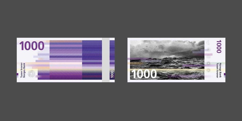
1,000 kroner — the sea that carries us forward
It is a symbol of the opposing force that tempers the Norwegian character, and at the same time a driving force — one that propels us forward, toward the future.
"For a millennium, the sea has been the foundation of our wealth, our contact with the wider world, and our faith in the future," states the website of the Norwegian central bank. "The sea presents us with challenges, rewarding experiences, and a horizon toward which we can direct our gaze — toward something infinite and unknown."
The reverse shows the open sea, with long streaks depicting a powerful storm. A pattern is visible that symbolises the water molecule and the crystalline structure of ice.
On security
In the final design, the bank departed from the original concepts of the winning studios in part because it wanted to raise the security level of the new currency. Banknotes are highly sophisticated objects, containing a multitude of complex security features and codes — some visible, others hidden from view. At the international level, banknotes share a common visual language, known as the "banknote design language." Within this framework, security requirements placed strict limits on creative ideas. Even so, those constraints proved a kind of creative engine here, compelling the designers to find something distinctive within a vast set of fixed parameters.
The Norwegian krone has retained its historic colour palette — a deliberate choice to avoid confusion. The notes are printed on cotton paper coated with a dirt-resistant finish. Intaglio printing was used in their production, and the relief texture along the edges of the notes helps blind and visually impaired people distinguish between denominations.
The film The making of Norway's new banknotes
If you would like to learn more about the story behind the new banknotes, we invite you to watch this 26-minute film, The making of Norway's new banknotes.

Final designs on the official website of Norges Bank: 50 kroner, 100 kroner, 200 kroner, 500 kroner,1,000 kroner
Photography: Snohetta, The Metric System, Norges Bank
If you are interested in Norway, we suggest reading a couple more articles — for instance, about the branding for the Festningen restaurant, located in a former Norwegian prison, or about the pavilion by the studio Snøhetta, designed for observing wild reindeer.