Design studio Waterfrom completed an interior design project for the Taipei home of a women's fashion designer.
Various works by the celebrated fashion illustrator René Gruau provided the inspiration, bringing a bold and vibrant sensibility to every interior space in the home. Just as Gruau's work weaves together motifs from classical Japanese drawing and the mood of Toulouse-Lautrec, so the interior achieves a harmonious coexistence of volumes rendered in different colours, textures and forms.


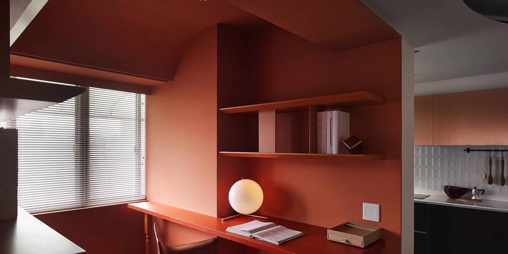
The rhythmic geometry of the space creates the interior's principal colour contrast: between the work zone, finished in a shade of blood orange, and the entrance area with its electric-blue bookcase. The contrast is reinforced by the interplay of different textures — dense and matte against semi-transparent, set off by polished glass. Worth noting, too, is a further contrast: the work zone opens onto a large window, while a fireplace is built into the bookcase itself, setting natural light against artificial illumination.
The layering of textures — achieved through the transparency of one of them — is employed in the living area. Here, the glossy, transparent cabinet doors do not conceal the rough texture of the slate-stone tiles behind them. Equally notable is the role played by the metal structures: one frames the glass, graphically accentuating the volume's form, while another resolves into an abstract pattern that induces an optical illusion.


The kitchen, finished with gold detailing, and the dining area complement and contrast with one another — the latter, despite the angularity of the overall interior, takes on a rounded form. Notably, the shapes of the table and the suspended ceiling structure quietly emphasise the simplicity of this zone, making it a pause within the interior's dominant contrast.
Graphic linearity is a distinctive device here; it carries an allusion to the French style. The decorative treatment of the bathroom cladding, the ceiling structure in the living area and the storage solutions in the bedroom are all examples of this approach to detailing — resolved through the graphic quality of their construction.


It is interesting to see how the furniture functions in this interior. It does not define the space — it complements it, reinforcing the overall approach and adding warmth. Lighting works in the same way: marking out a particular zone, as with the cluster of pendants above the dining table, or accentuating form, as with the built-in lighting within the bookcase structure.
Every device used in this interior draws attention to the architecture; as a result, each decision reads as both concise and expressive — much like the artistic techniques René Gruau employed in his celebrated posters.
An equally bold approach to colour in the BMW Museum